In this article, we will learn about Minimalism web design. We will explore design principles and how to apply them to create simple, clean, and effective websites. Minimalism not only provides a better user experience but also helps increase conversion rates and build a strong Brand.
What is Minimalism?
Minimalism is a style that emphasizes simple, uncomplicated lines, aiming for harmony and elegance. Minimalism style of minimalist Website Design originated in the early 1900s with the pioneering of German designer – Lucian Bernhard.
This is a timeless style, applied in many fields such as: architecture, interior, fashion, graphics, etc. It is also favored by many designers. Minimal style will minimize unnecessary details, a minimalist website will have space to focus on the core Content.
This helps improve user experience (UX) as the interface aims to deliver meaningful content.
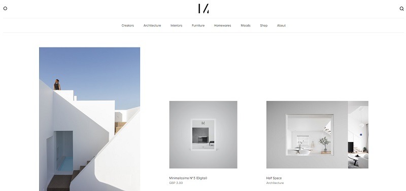
Minimalism inspiration website is inspired by minimizing redundant content.
Why should you choose Minimalism style for website design?
Minimalism is a minimalist website design style that emphasizes providing the best possible user experience. Here are some specific reasons why you should design your website in a minimalist style:
A website with too much content and highlights will distract the reader’s attention from the main message that the website wants to convey. Therefore, a website with a minimalist design style and open space will help viewers follow the information more easily.
For example, a restaurant website uses simple fonts and large text sizes to display the menu in an easy-to-read and memorable way.
Fast page loading speed
A beautiful minimalist web design often uses fewer graphic elements, images, and complex effects, which reduces the size of the web page and increases page loading speed. As a result, users do not have to wait long when accessing the website, they tend to stay on the website to explore more content. This helps reduce bounce rates and increase the average time per session.
For example, Google Search’s homepage is famous for its extremely minimalist design, featuring only the Google logo, a search bar, and a few buttons. This design allows the homepage to load instantly, regardless of the user’s internet connection speed.
Use primary colors
Minimalist web interfaces often have a few dominant colors that help create an interface that is easy to see and remember.
For example, a fashion store website using simple colors like black, white, and gray will create a modern, elegant, and luxurious look.
Minimalism style minimalist website design focuses on important content
Focusing on the important content is an important part of Minimalism style of website design. By removing unnecessary elements, the website can focus on the main message and provide the best possible user experience.
For example, a software company’s website only displays necessary information (products, services, contact information, etc.), avoiding confusing users with irrelevant elements (inappropriate advertisements or images that do not convey the message, etc.).
Flexible and compatible with multiple devices
By reducing unnecessary elements and optimizing the structure, the website can be displayed easily on a variety of devices such as desktops, laptops or Mobile phones.
For example, a graphic design firm’s website can easily adjust to display well on both desktop and mobile devices without having to scroll horizontally or zoom in and out of the site.
Easy to use interactive
Minimalist web layouts make it easier for users to find information and interact with the website in a more natural way. Intuitive elements and a focus on the main content keep users from getting lost while browsing.
For example, a mobile app’s website has a simple interface with clear and easy-to-click buttons, making it easy for users to find information.
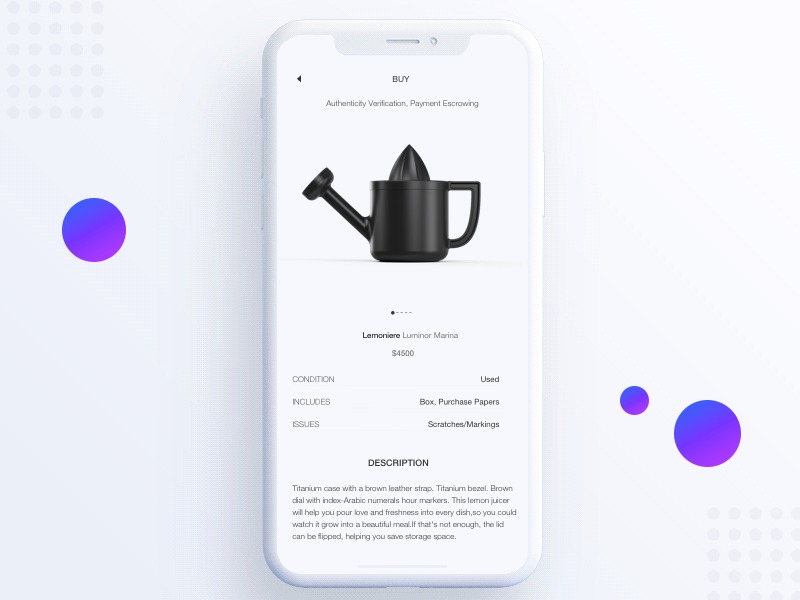

One application of Minimalism in web design is to increase compatibility with multiple devices.
Is the process of arranging and organizing elements on a website according to their importance and priority. In Minimalism style of website design, good control of hierarchy will help users easily recognize and understand the importance of elements on the website.
For example, on a university website, a short paragraph about the school is highlighted in large text size. Meanwhile, the university’s address, phone number, and Email are displayed at the bottom of the page in smaller text size.
Enhance user experience
Minimalist web layouts create a more intuitive and understandable user experience. By reducing complexity and eliminating unnecessary elements, users can easily interact and find information on the website quickly and efficiently.
For example, a hotel booking app’s website only displays essential features like search, booking, and payment. By cutting out unnecessary elements like irrelevant ads, the site creates an intuitive and easy-to-use experience that saves users time when booking.
Minimalism style of website design often creates an elegant, modern feeling with harmonious colors and balanced content. The simplicity and sophistication in design help the website become professional and highly aesthetic.
Easy to maintain and manage
Minimalist design will keep the website structure and content clean and simple, administrators can easily update information, change the interface and perform other tasks efficiently.
For example, a local restaurant’s website has a simple layout with just a menu and contact information. By eliminating unnecessary elements like animations or slideshows, the restaurant can easily update its menu, hours, and contact information quickly and efficiently.
Easy to integrate new technology
When a website has a lot of empty space, it creates flexibility for integrating new features without changing the structure of the website too much. New elements can be inserted into these empty spaces easily and without affecting the user experience.
For example, a minimalistic ecommerce website can integrate a chatbot to provide instant support and answer customer questions. The empty space on the website can be used to display the chatbot window conveniently and without distracting the user.
The Basic Principles of Minimalism Web Design
To build a Minimalism style of website design, you need to ensure some basic principles. Specifically:
Negative space – Negative space
Negative space (white space) is often used in Minimalism website design and accounts for a relatively large proportion.
The main purpose of this space is to create a break for users when accessing the content. Ensuring this principle will help the minimal website become more airy and neat.
High Definition Image
These are images with appropriate resolution, not blurred or broken. This principle helps create a professional impression, increase aesthetic value, convey information effectively and increase the reliability of the website.
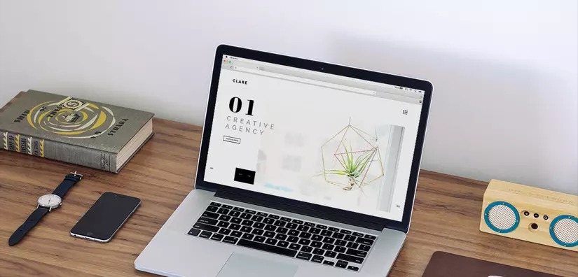
Dramatic typography and visual balance make the website more appealing.
Typography in Minimalism style minimalist website design is the art of designing, creating fonts to be skillful, sophisticated and stylish. In the minimalist space of a Minimalism website, an ornate font will be a visual highlight, attracting the attention of readers.
Highlight the contrast
Contrast is expressed in the combination of opposing elements in size, color, style, etc.
For example, you can put large, bright letters on a dark cover or use two fonts with contrasting colors, etc. This also has the effect of attracting the eye, making the content you want to convey more eye-catching.
Simple navigation bar
A simple navigation bar can be a drop-down menu or a horizontal menu bar. Creating a minimalist website with a friendly navigation bar will help them easily find the desired content with just a few mouse clicks. This will greatly improve the user experience.
The principle of Minimalism style in designing this website is expressed in the arrangement of content layout on the page in a symmetrical and harmonious way. The balanced visual effect will help readers have a faster and more logical experience accessing the content.
Elements of Minimalism Style Minimalist Website Design
To make the Minimalism style of website design not boring and monotonous, you can develop a few more outstanding elements on the page. Below are the elements that you can refer to add to the minimalist website while still ensuring harmony:
These are textures that are light in color or almost the same color as the background. The low contrast of these textures will create a slight accent to the website without breaking the overall harmony. You can place the main content in minimal textures to highlight that information on the page.
Color inversion
These are graphic details and content with contrasting colors that stand out more than the minimal color scheme of the page. Using these colors will create a highlight on the website, helping readers quickly grasp the information being conveyed.
More interactive effects
You can add dynamic effects to your minimal website such as image slides, popups, etc. Displaying dynamic content on a static web background will help that information stand out, stimulating users to interact with the page.
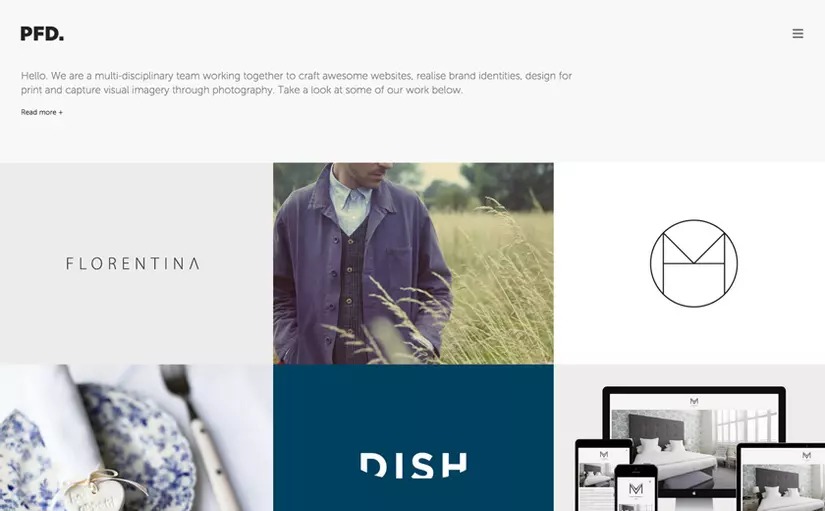
Using the reversed colors of black and white helps the website stand out in a subtle way.
Asymmetrical layout
Sometimes, the symmetry of Minimalism in website design can be replaced by an asymmetrical layout. This difference has an impressive aesthetic and creates a fresh perspective, bringing strong emotions to the user.
Improve availability
The maximum information distillation of Minimalism style in web design can make viewers not know where to find more information, how to interact? Therefore, improving usability, adding interactive points will significantly improve the user experience.
Minimalism style of website design is not only beautiful and elegant but also helps to improve user experience. By focusing on important elements, eliminating unnecessary details, these websites help readers focus on meaningful content. Hopefully, our article has helped you understand more about the minimalist website design trend.
References: Bizfly
Comment Policy: We truly value your comments and appreciate the time you take to share your thoughts and feedback with us.

Note: Comments that are identified as spam or purely promotional will be removed.

To enhance your commenting experience, consider creating a Gravatar account. By adding an avatar and using the same e-mail here, your comments will feature a unique and recognizable avatar, making it easier for other members to identify you.

Please use a valid e-mail address so you can receive notifications when your comments receive replies.