After my favorite plugin GenerateBlocks updated, it immediately conflicted with a WordPress table of contents plugin I’ve been using for years — Fixed TOC.
Choosing which plugins to remove was difficult for me because I spent a lot of time customizing them and they were all useful plugins.
In the end, I had to make the decision to find an alternative to Fixed TOC.
In this tutorial, I will show you how to add an auto-generated table of contents to your WordPress site in a few quick steps.
1. What is Tocbot?
Right from the title of the post, you might be curious to know what it is?
Tocbot is a JavaScript (JS) library that helps generate Table of Contents (TOC) from the headings in the HTML document.
This library uses the methods DOM and avoids jQuery & jQuery UI dependencies. If you are an advanced WordPress user, you know that this is a really big plus.
Tocbot includes the following features:
- Find out the title of the post (like h2)
- Create links to those sections
- Let readers know where they are on the page
In this tutorial, I will be using GeneratePress theme but the steps below apply to any WordPress theme.
2. How to create a table of contents
There is a difference in how users experience items on my site:
- With the desktop interface, I put the table of contents in the left margin of the post.
- For Mobile, I put the table of contents in the beginning of the post content.
Add JS
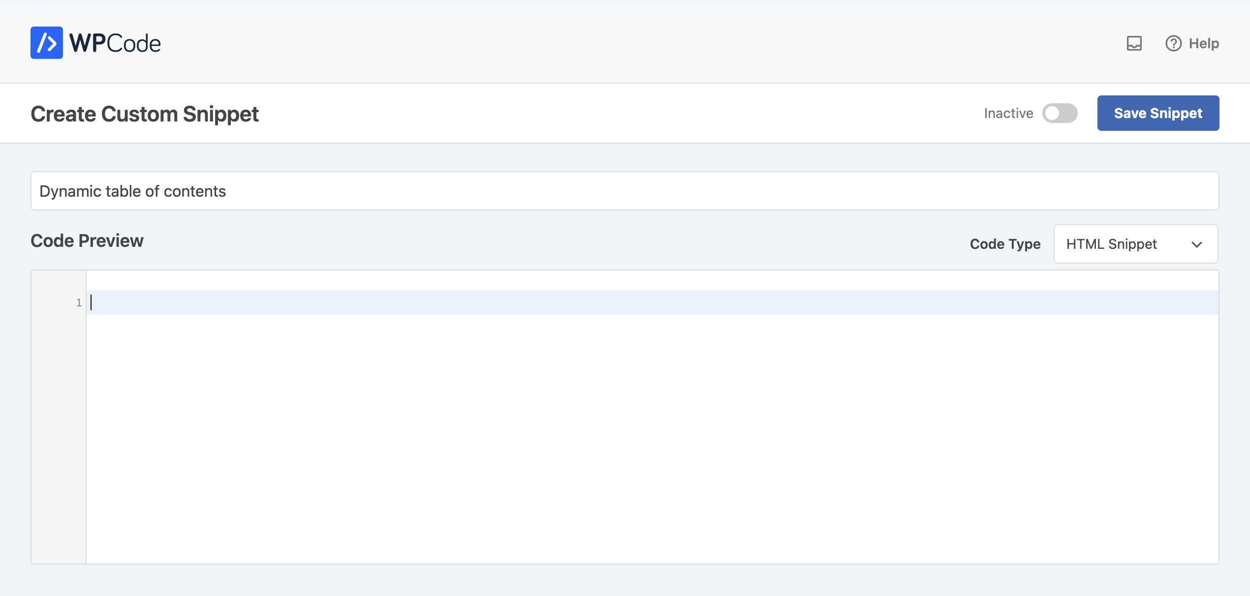
You install a WordPress plugin called WPCode. It can help you insert code snippets anywhere you want.

In the Code Preview section, you add the JS script:
<script src="https://cdnjs.cloudflare.com/ajax/libs/tocbot/4.28.2/tocbot.min.js"></script>At the time of writing, Tocbot is at version 4.28.2. When installing it on your site, use the latest version by updating the version number in the URLs.
After adding the script, you need to initialize it so that Tocbot knows where in the post you want the table of contents and what you want to add to it.
Add these lines of code right in the JS script above:
<script>
window.addEventListener('load', (event) => {
 document.querySelectorAll('h2').forEach(function(el, i) {
    el.id = i
  })
tocbot.init({
// Where to render the table of contents.
tocSelector: '.toc',
// Where to grab the headings to build the table of contents.
contentSelector: '.content-area',
// Which headings to grab inside of the contentSelector element.
headingSelector: 'h2',
// For headings inside relative or absolute positioned containers within content.
hasInnerContainers: true,
// Headings offset between the headings and the top of the document (this is meant for minor adjustments).
headingsOffset: 40,
// Smooth scroll offset.
scrollSmoothOffset: -40,
  });
});
</script>.tocis where you want the table of contents to be displayed..content-areais the content area where you want Tocbot to look for title tags
Add CSS
Although Tocbot has a CSS library, I don’t use it that way. I want to customize the CSS to my needs.
If you want to display a table of contents that looks like the one on BetterGrowth posts, you can add my CSS after the code above:
<style>
@media screen and (min-width: 1024px) {
.inside-left-sidebar {
display: flex;
flex-direction: column;
max-height: calc(100vh - 80px);
position: sticky;
top: 50px;
}
.toc>.toc-list li {
list-style: none;
margin-right: 5px;
}
.toc-list {
max-height: 320px;
overflow-y: scroll;
}
.toc-list::-webkit-scrollbar {
width: 4px;
background: 0;
}
.toc-list::-webkit-scrollbar-thumb {
background: #eeeeee;
border-radius: 8px;
}
#bg-toc
.is-active-link {
color: #00AE4F !important;
}
#bg-toc
a.toc-link {
padding: 4px 0;
display: block;
line-height: 1.5;
font-size: 14px;
overflow: hidden;
color: #6f7672;
-webkit-transition: all .33s ease-out;
-moz-transition: all .33s ease-out;
-o-transition: all .33s ease-out;
transition: all .33s ease-out;
}
#bg-toc
a.toc-link:hover {
color: #001107;
}
.post-navigation-left .nav-title {
font-style: normal;
font-weight: 600;
font-size: 16px;
line-height: 24px;
color: #001107;
padding: 0 0 10px 0;
}
.post-navigation-left .nav-title:before {
content: url(data:image/svg+xml,%3Csvg%20xmlns%3D%22http%3A%2F%2Fwww.w3.org%2F2000%2Fsvg%22%20width%3D%2216%22%20height%3D%2214%22%20viewBox%3D%220%200%2020%2020%22%20fill%3D%22none%22%20stroke%3D%22%236f7672%22%20stroke-width%3D%221.8%22%20stroke-linecap%3D%22round%22%20stroke-linejoin%3D%22round%22%3E%3Cpath%20d%3D%22M17%209.5H3M21%204.5H3M21%2014.5H3M17%2019.5H3%22%2F%3E%3C%2Fsvg%3E);
padding-right: 7px;
}
}
@media screen and (max-width: 768px) {
#bg-toc-mobile {
padding: 20px 20px 15px;
background: #F7F9FA;
border-radius: 6px;
margin-bottom: 1.5em;
border: 1px solid rgb(0 34 15 / 5%);
}
#bg-toc-mobile
.toc>.toc-list li {
list-style: none;
margin-right: 5px;
margin-bottom: 0 !important;
}
#bg-toc-mobile
.toc-list {
max-height: 300px;
overflow-y: scroll;
}
#bg-toc-mobile
ol.toc-list {
margin: 0 !important;
}
#bg-toc-mobile
.toc-list::-webkit-scrollbar {
width: 4px;
background: 0;
}
#bg-toc-mobile
.toc-list::-webkit-scrollbar-thumb {
background: #a1a6a3;
border-radius: 8px;
}
#bg-toc-mobile
a.toc-link {
padding: 5px 0;
display: block;
line-height: 1.65;
font-size: 16px;
overflow: hidden;
color: #00AE4F;
-webkit-transition: all .33s ease-out;
-moz-transition: all .33s ease-out;
-o-transition: all .33s ease-out;
transition: all .33s ease-out;
}
#bg-toc-mobile
a.toc-link:hover {
color: #00AE4F;
}
.post-navigation-inline .nav-title {
font-style: normal;
font-weight: 600;
font-size: 16px;
line-height: 24px;
color: #001107;
padding-bottom: 10px;
}
.post-navigation-inline .nav-title:before {
content: url(data:image/svg+xml,%3Csvg%20xmlns%3D%22http%3A%2F%2Fwww.w3.org%2F2000%2Fsvg%22%20width%3D%2216%22%20height%3D%2214%22%20viewBox%3D%220%200%2020%2020%22%20fill%3D%22none%22%20stroke%3D%22%236f7672%22%20stroke-width%3D%221.8%22%20stroke-linecap%3D%22round%22%20stroke-linejoin%3D%22round%22%3E%3Cpath%20d%3D%22M17%209.5H3M21%204.5H3M21%2014.5H3M17%2019.5H3%22%2F%3E%3C%2Fsvg%3E);
padding-right: 7px;
}
}
</style>
In case you want to use Tocbot’s default CSS, you can add a script file instead of my CSS snippet above:
<link rel="stylesheet" href="https://cdnjs.cloudflare.com/ajax/libs/tocbot/4.28.2/tocbot.css"> If you want to customize your own CSS based on Tocbot’s original CSS, you can visit the Tocbot CSS link above and use CSS minifier.
In summary, here’s what you need to add to the Code Preview section:
<script src="https://cdnjs.cloudflare.com/ajax/libs/tocbot/4.28.2/tocbot.min.js"></script>
<script>
window.addEventListener('load', (event) => {
document.querySelectorAll('h2').forEach(function(el, i) {
el.id = i
})
tocbot.init({
// Where to render the table of contents.
tocSelector: '.toc',
// Where to grab the headings to build the table of contents.
contentSelector: '.content-area',
// Which headings to grab inside of the contentSelector element.
headingSelector: 'h2',
// For headings inside relative or absolute positioned containers within content.
hasInnerContainers: true,
// Headings offset between the headings and the top of the document (this is meant for minor adjustments).
headingsOffset: 40,
// Smooth scroll offset.
scrollSmoothOffset: -40,
});
});
</script>
<style>
@media screen and (min-width: 1024px) {
.inside-left-sidebar {
display: flex;
flex-direction: column;
max-height: calc(100vh - 80px);
position: sticky;
top: 50px;
}
.toc>.toc-list li {
list-style: none;
margin-right: 5px;
}
.toc-list {
max-height: 320px;
overflow-y: scroll;
}
.toc-list::-webkit-scrollbar {
width: 4px;
background: 0;
}
.toc-list::-webkit-scrollbar-thumb {
background: #eeeeee;
border-radius: 8px;
}
#bg-toc
.is-active-link {
color: #00AE4F !important;
}
#bg-toc
a.toc-link {
padding: 4px 0;
display: block;
line-height: 1.5;
font-size: 14px;
overflow: hidden;
color: #6f7672;
-webkit-transition: all .33s ease-out;
-moz-transition: all .33s ease-out;
-o-transition: all .33s ease-out;
transition: all .33s ease-out;
}
#bg-toc
a.toc-link:hover {
color: #001107;
}
.post-navigation-left .nav-title {
font-style: normal;
font-weight: 600;
font-size: 16px;
line-height: 24px;
color: #001107;
padding: 0 0 10px 0;
}
.post-navigation-left .nav-title:before {
content: url(data:image/svg+xml,%3Csvg%20xmlns%3D%22http%3A%2F%2Fwww.w3.org%2F2000%2Fsvg%22%20width%3D%2216%22%20height%3D%2214%22%20viewBox%3D%220%200%2020%2020%22%20fill%3D%22none%22%20stroke%3D%22%236f7672%22%20stroke-width%3D%221.8%22%20stroke-linecap%3D%22round%22%20stroke-linejoin%3D%22round%22%3E%3Cpath%20d%3D%22M17%209.5H3M21%204.5H3M21%2014.5H3M17%2019.5H3%22%2F%3E%3C%2Fsvg%3E);
padding-right: 7px;
}
}
@media screen and (max-width: 768px) {
#bg-toc-mobile {
padding: 20px 20px 15px;
background: #F7F9FA;
border-radius: 6px;
margin-bottom: 1.5em;
border: 1px solid rgb(0 34 15 / 5%);
}
#bg-toc-mobile
.toc>.toc-list li {
list-style: none;
margin-right: 5px;
margin-bottom: 0 !important;
}
#bg-toc-mobile
.toc-list {
max-height: 300px;
overflow-y: scroll;
}
#bg-toc-mobile
ol.toc-list {
margin: 0 !important;
}
#bg-toc-mobile
.toc-list::-webkit-scrollbar {
width: 4px;
background: 0;
}
#bg-toc-mobile
.toc-list::-webkit-scrollbar-thumb {
background: #a1a6a3;
border-radius: 8px;
}
#bg-toc-mobile
a.toc-link {
padding: 5px 0;
display: block;
line-height: 1.65;
font-size: 16px;
overflow: hidden;
color: #00AE4F;
-webkit-transition: all .33s ease-out;
-moz-transition: all .33s ease-out;
-o-transition: all .33s ease-out;
transition: all .33s ease-out;
}
#bg-toc-mobile
a.toc-link:hover {
color: #00AE4F;
}
.post-navigation-inline .nav-title {
font-style: normal;
font-weight: 600;
font-size: 16px;
line-height: 24px;
color: #001107;
padding-bottom: 10px;
}
.post-navigation-inline .nav-title:before {
content: url(data:image/svg+xml,%3Csvg%20xmlns%3D%22http%3A%2F%2Fwww.w3.org%2F2000%2Fsvg%22%20width%3D%2216%22%20height%3D%2214%22%20viewBox%3D%220%200%2020%2020%22%20fill%3D%22none%22%20stroke%3D%22%236f7672%22%20stroke-width%3D%221.8%22%20stroke-linecap%3D%22round%22%20stroke-linejoin%3D%22round%22%3E%3Cpath%20d%3D%22M17%209.5H3M21%204.5H3M21%2014.5H3M17%2019.5H3%22%2F%3E%3C%2Fsvg%3E);
padding-right: 7px;
}
}
</style>
Add HTML
By adding HTML, you define where the table of contents is displayed in your post.
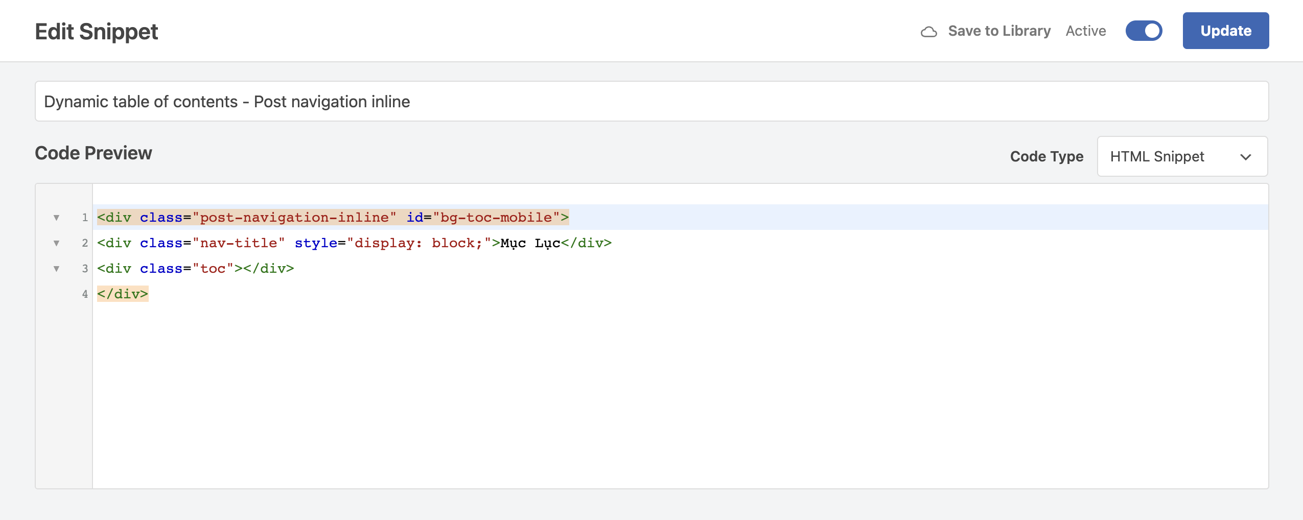
As mentioned above, I put the table of contents on the left sidebar of the post in the desktop view. So what I do is add this HTML code to the left sidebar.
<div class="post-navigation-left" id="bg-toc"> <div class="nav-title" style="display: block;">Menu</div> <div class="toc"></div> </div> <div class="post-navigation-inline" id="bg-toc-mobile"> <div class="nav-title" style="display: block;">Menu</div> <div class="toc"></div> </div> 
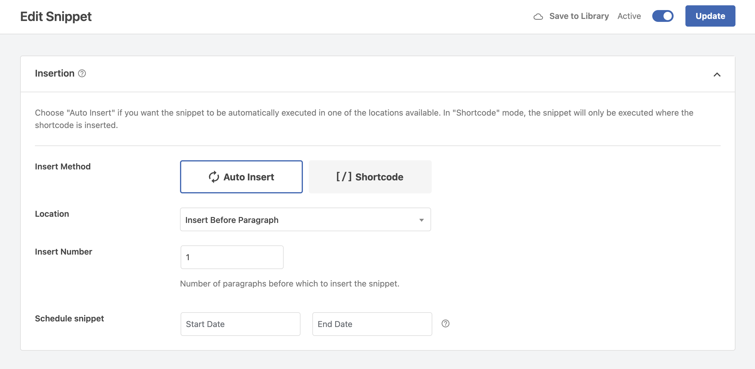
Then, you choose the position to display the table of contents on the phone interface by setting up in the Insertion section.

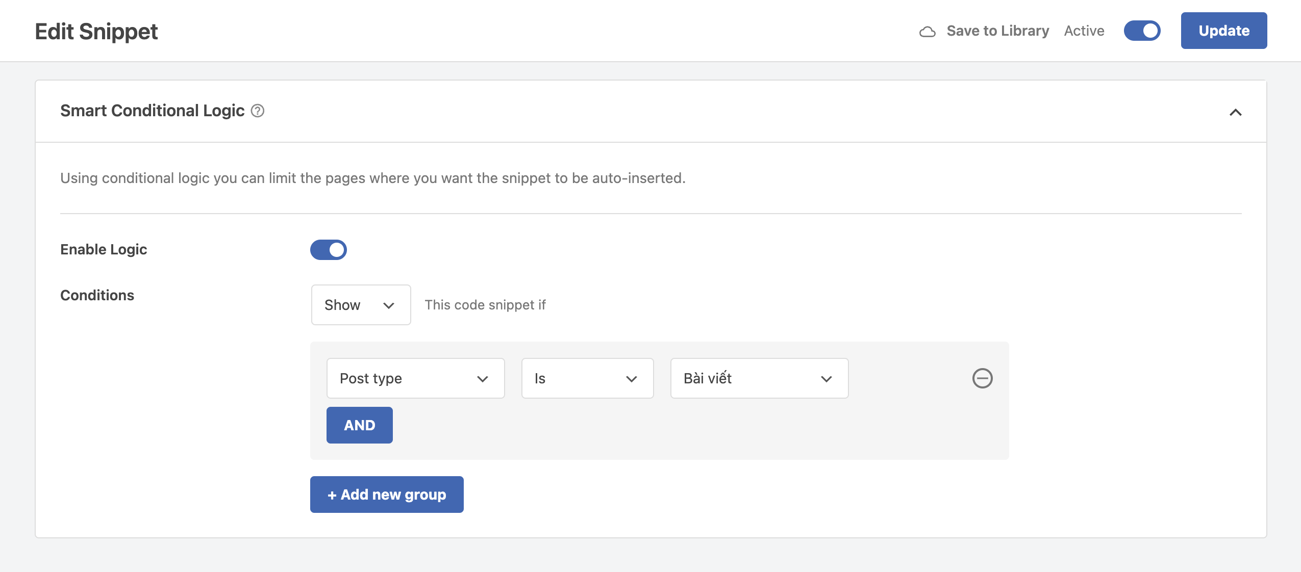
To only load the JS, CSS snippets and display the table of contents in posts, you need to set up conditions in the Smart Conditional Logic section for both Snippets you created in WPCode.

Was this guide helpful to you? If it worked for you, please leave a comment below. I would love it if it made sense.
Comment Policy: We truly value your comments and appreciate the time you take to share your thoughts and feedback with us.

Note: Comments that are identified as spam or purely promotional will be removed.

To enhance your commenting experience, consider creating a Gravatar account. By adding an avatar and using the same Email here, your comments will feature a unique and recognizable avatar, making it easier for other members to identify you.

Please use a valid email address so you can receive notifications when your comments receive replies.
