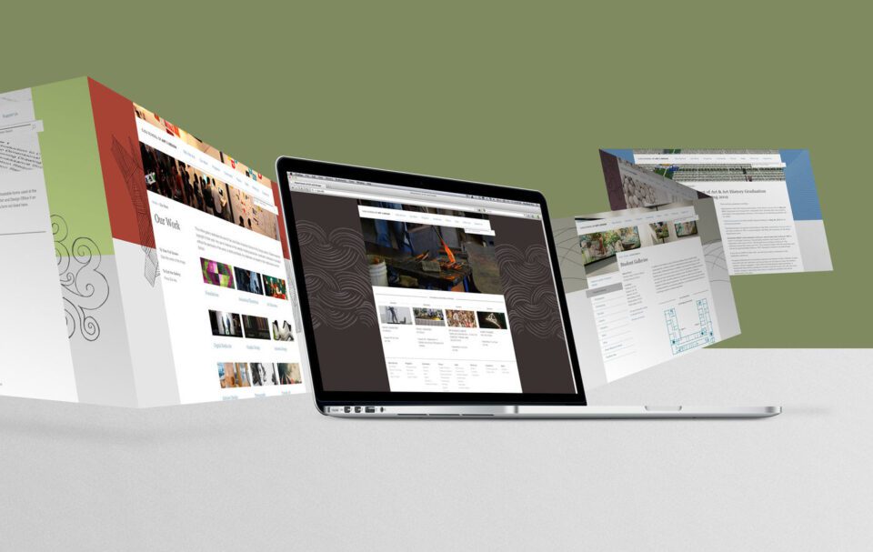
When your business expands online, designing a website is indispensable. However, creating a professional website with a beautiful interface is easy. In this article, MarkKnow will share with you 8 principles to help you Professional Website Design With a beautiful interface, please follow this article to the end!
What is website interface?
In the field of information technology, interface design refers to the process of creating user interfaces for software, websites or applications. Website interface design involves creating logical layouts and structures. In order to optimize the user experience.
The website interface is what you see when you visit a website. From the arrangement of positions, color choices to the way images are presented. All are considered part of the interface. An attractive and professional website interface will attract users. Helps create a positive impression at first sight.
Professional website design with Effective Interface
The website layout is well-organized
Z-Pattern Layout
When you open a new website, you probably have the habit of scanning from left to right on the first page. Then down to the left and ending at the bottom right. This is how readers typically scan the main content of a website. Professional website design This pattern usually has a Z or zigzag shape. Website design Z-Pattern layout:
- Position 1: Place the Brand logo. This is the first point that creates an impression on users.
- Position 2: Here you should put the menu bar and secondary CTA button that is eye-catching.
- Center of Page Position: Feature Image Slider in the center of the page to differentiate between the top and bottom of the page. Also keeps the reader’s eyes in a Z shape.
- Position 3: This is where you present engaging content and featured images/videos.
- Position 4: The position of the CTA button urges users to take action.
The Z-Pattern layout is often suitable for professional website design. Simple, with little text like landing pages. To optimize the main function of attracting views, clicks or stimulating purchasing behavior.
F-Pattern Layout
The F-Pattern layout also starts from the left and moves to the right. However, this layout focuses more on important text content. Websites designed in this F-pattern are suitable for home pages or blogs.
Professional website design maintains consistency
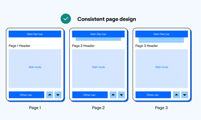
Consistency in web design is a key factor in making your website look attractive and professional. Make sure your design is consistent across design elements on each page. Specifically, consistency should be demonstrated in the use of fonts, sizes, main headings, subheadings, and CTA button styles throughout the website. You should not use too many different fonts, font sizes, and CTA button styles on the website. This will confuse readers and not show professionalism.
Before professional websitedesign you need to plan ahead. Determine the right fonts and colors for text, buttons, and other website elements. Use CSS (Cascading Style Sheets) to style your website. Help you maintain complete and consistent information about design elements across your entire website.
Readable and friendly font
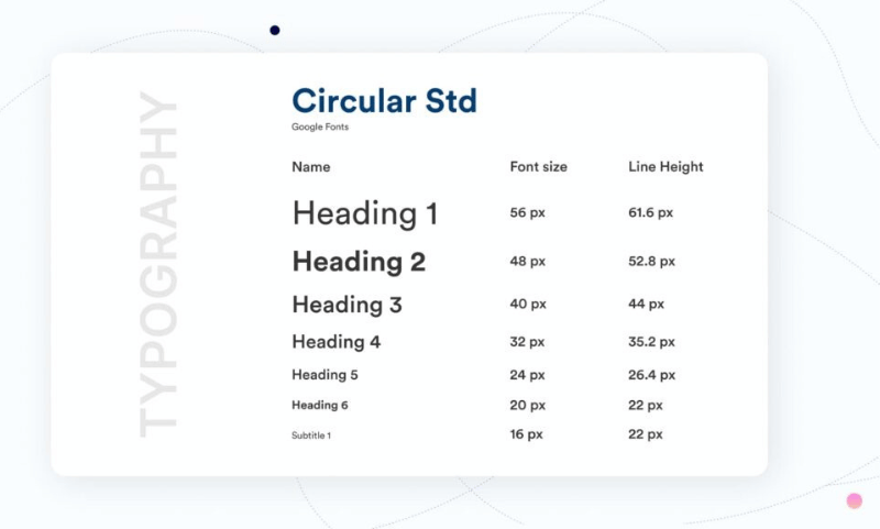
Choosing a font when designing a Sales website plays a very important role. First, choose a font that is easy to read, avoid fonts that are too complicated. Users usually only spend a few seconds browsing your website. So choose a font that they can read easily and quickly. At the same time, you should choose a consistent and recognizable font for the entire website.
In addition to user-friendly fonts. You should also pay attention to choosing fonts that are compatible with web browsers to avoid font errors. Some fonts are commonly used in professional website design: Arial, Verdana, Courier New, Serif + Sans Serif, Script, Roboto,…
Color palette and images help design professional websites
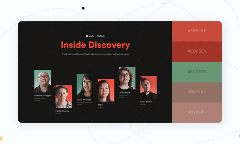
Depending on the message you want to convey to users. You will choose different color combinations. Besides, you also need to pay attention to the lightness and darkness of the colors. If the website design leans too much towards white tones, it will create a feeling of “lack of color”. On the contrary, when you choose dark colors such as reddish brown, it can lead to a “burned color” situation. Therefore, you should pay attention to the harmonious balance between light and dark, bold and light. To create a harmonious and attractive visual whole.
Good compatibility on all devices
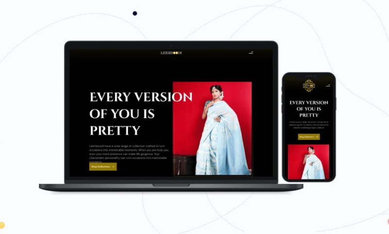
Nowadays, most people use smartphones to browse the web, search for information and shop online. Therefore, it is important to ensure that your website is friendly to all devices. Professional website design to be compatible (Responsive) and display full content on all types of screens. Including computers, laptops, phones and tablets. This makes the website more beautiful and optimizes the user experience.
Professional website design with fast page loading speed
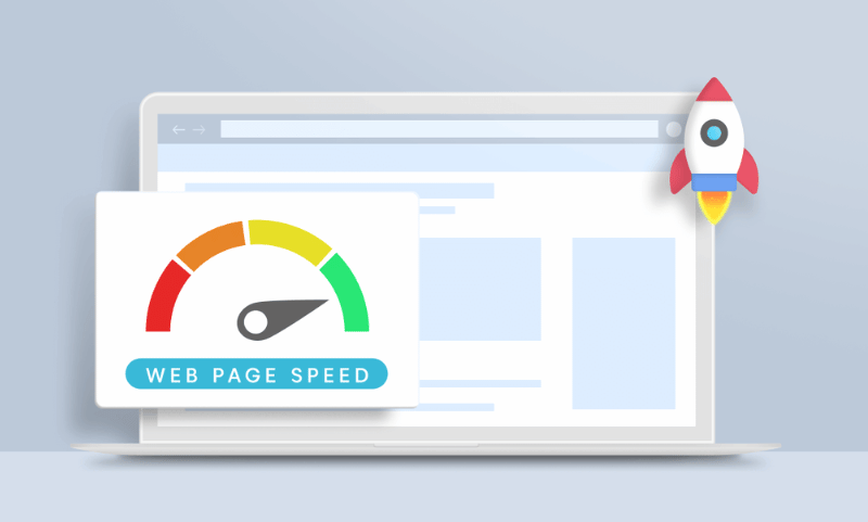
Professional website design Effectiveness requires fast loading time. A maximum page loading speed of 3 seconds is the standard for your website to appear. Therefore, you should take care of your website by optimizing large images. Before uploading images to the website, you can use online image compression tools such as Tinypng, img2go… to compress the size of the image.
Additionally, you should optimize your code by combining CSS or JavaScript files into one file to reduce the number of HTTP requests. You can also compress HTML, JavaScript, and CSS to speed up your website loading speed.
Easy and logical site navigation
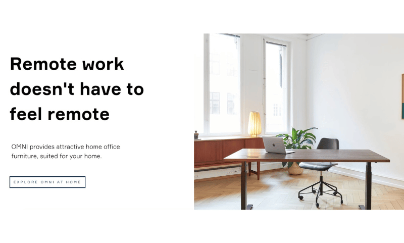
Visitors are more likely to stay longer on websites that have easy navigation. For an effective navigation system, you can study creating a logical hierarchical page structure. Use breadcrumbs and design clickable buttons. You should professional website design follow the “three click” principle to ensure visitors can access the necessary information in just 3 clicks maximum.
Professional website design to suit user needs
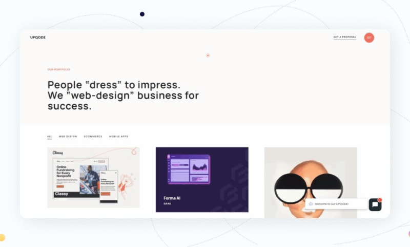
If your website can communicate effectively with visitors, they will stay on your website longer. You can establish easy communication with visitors by organizing information well with main headings and subheadings, cutting down on long writing and using bullet points instead of long sentences. Besides, you should provide quality content, useful information, easy to read, easy to understand for viewers.
Comment Policy: We truly value your comments and appreciate the time you take to share your thoughts and feedback with us.
Note: Comments that are identified as spam or purely promotional will be removed.
To enhance your commenting experience, consider creating a Gravatar account. By adding an avatar and using the same e-mail here, your comments will feature a unique and recognizable avatar, making it easier for other members to identify you.
Please use a valid e-mail address so you can receive notifications when your comments receive replies.
