We will learn about the important elements of banner design, how to use color and images to attract customers’ attention, as well as design principles to create unique and impressive banners. In this article, we will explore more than 15 ways to create attractive and effective banner ads.
Businesses use banner Advertising to expand their customer reach. In addition to impressive design, banners need to convey marketing messages clearly.
Use standard banner sizes
Each advertising platform from websites, social networking sites or Mobile applications has its own regulations and requirements for banner sizes. Therefore, the way to help advertising banners attract more customers is to ensure the right size.
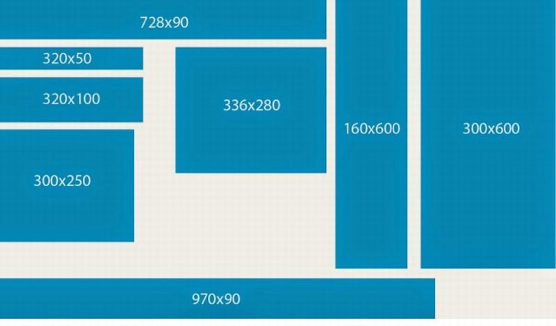
The person responsible for designing the banner needs to understand the size regulations to ensure the banner is displayed well and not broken. Refer to some common banner sizes (in pixels) below:
- Website: 300x250px, 728x90px, 320x100px
- Social network: Facebook: 1200x628px, Instagram: 1080x1080px
- Display advertising: 300x600px, 468x60px

Some standard banner sizes.
Choosing the right location is the way to help your banner ads attract customers.
When designing banners online or offline, the placement of the banner ad plays a key role. Here are some ways to help your banner ad attract more customers.
Online
- Prominent location: Place banners in the most visible locations on your website or app. For example, at the top of the page, on the left column, or after scrolling down.
- Related Locations: Place banners next to posts on websites or apps relevant to the product/service you want to promote.
- Target location: Use advertising tools to target banners to potential customers based on interests, behaviors, and demographics
Offline
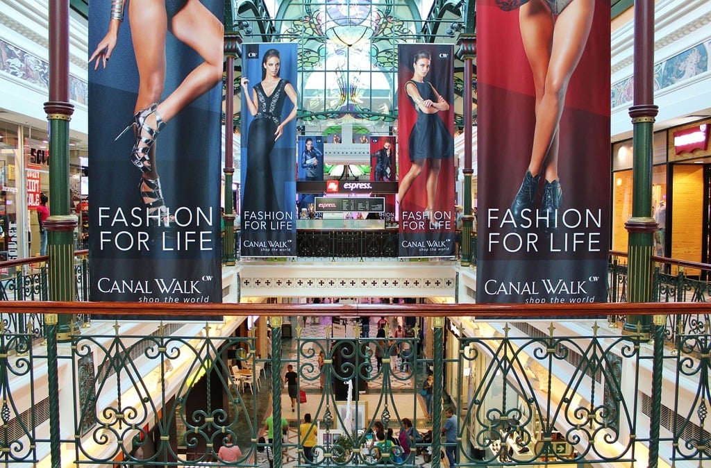
- High-traffic location: Place banners in crowded places such as shopping malls, bus stations, airports, etc.
- Location suitable for the product: For example, if you sell sporting goods, place a banner at a gym or stadium.
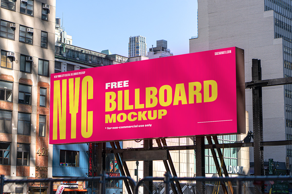
- Size fits all: Make sure the banner is the right size for the space and is easily visible from a distance.

Choose the right banner location to effectively attract customers.
Banner layout
An easy-to-see, easy-to-read layout that attracts customers and increases Brand recognition is one of the ways to help advertising banners attract more customers.
Typically, a banner layout needs to meet the following three elements:
– Minimalism: Use a simple, easy-to-read layout with few details to attract attention and convey your message quickly.
– Classification: Use elements like size, color, and position to create information hierarchy, drawing attention to the most important information.
– Balance: Elements of images, text, and white space to create a layout that is harmonious and pleasing to the eye.
Brand Logo
- Location: Place your brand logo in a visible location, usually in the top left or bottom right corner of the banner.
- Size: The logo size must be appropriate to the overall banner and easy to read.
- Identification: Ensure the logo is clearly displayed and consistent with the brand identity.
Information on banner
The information content on the banner will most clearly show the products/services you provide, so take advantage of attracting customers with attractive offers, promotions, and exciting deals with phrases such as: “Shocking sale”, “70% discount”, “limited quantity”, “high quality”, “Price from only $9.99”,…
In summary, the content needs to ensure:
– Concise, brief, concise, conveying the main message of the banner.
– Highlight the most important information such as product name, price, promotions, etc.

Arrange the layout and information on the banner appropriately.
CTA – Call to Action
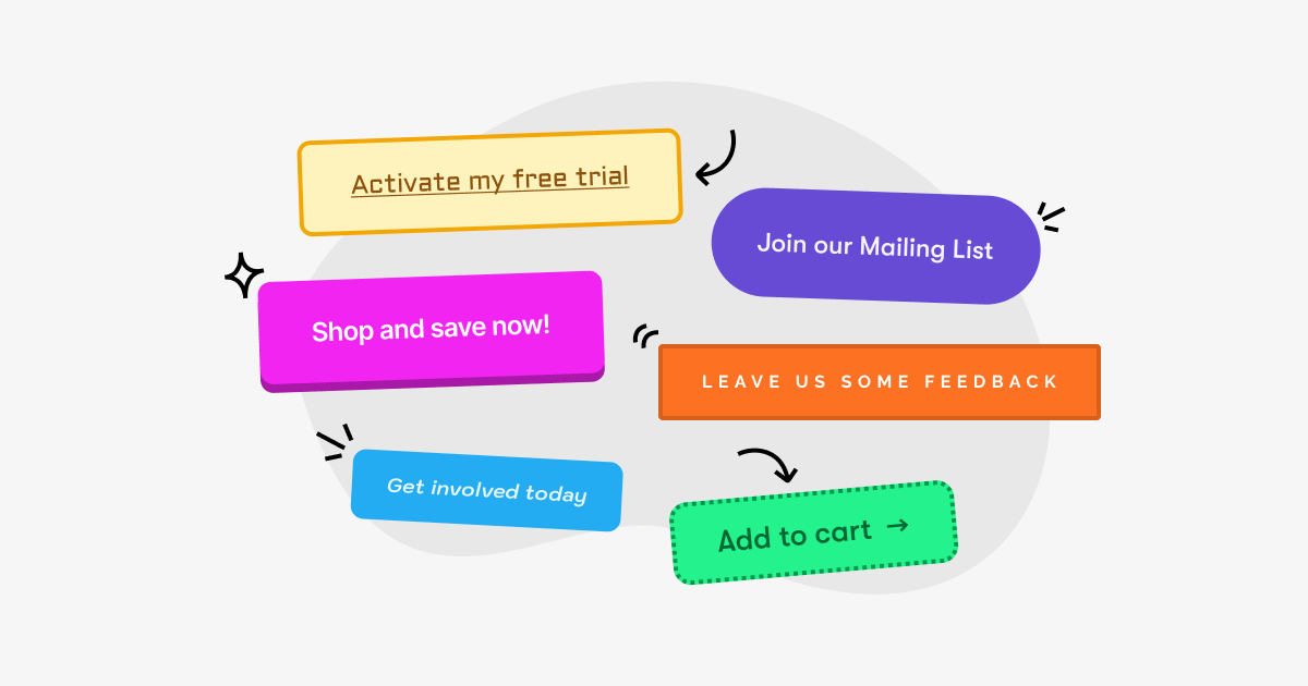
CTA is an important element that cannot be missed in every banner. Prioritize the use of color, font and prominent position to attract customers’ attention to this call to action.
At the same time, one way to make your banner ads more attractive is to use strong verbs and create a sense of urgency to encourage customers to take the desired action immediately, such as: “Buy now”, “Learn more”, “Discover now”, “Don’t miss out”, “Click now”.
Compelling message
The message includes parts such as: Title, content and benefits as well as the value customers receive from your service will be the way to help the advertising banner attract more customers. Specifically:
- Title: Use short, concise, and attention-grabbing titles.
- Content: Attractive, hitting directly at the needs and desires of customers.
- Benefit: Emphasize the benefits that customers receive when using your product/service.

Message content, attractive appeal, attracting customers.
Use eye-catching images and graphics
In addition, one of the ways to help advertising banners attract more customers is to choose images and graphics. Banner designers ensure the following factors:
- Sharp, clear images attract customers’ attention.
- Images need to be directly related to the product, service and message you want to convey.
At the same time, you should note that you should only use a maximum capacity of less than 150KB for online advertising banners – according to Google Adword recommendations. Because for banners on online platforms, it is necessary to ensure fast loading speed before uploading to the website.
Use the right colors
Each color placed in the banner has its own characteristics, so when choosing colors, it is necessary to follow some of the following factors:
- Use brand colors to create consistency and better brand recognition.
- Use contrasting colors to highlight key content and attract viewers.
- Avoid mixing too many bright colors, making the banner confusing and difficult to see.
Easy to read, attractive font
One factor when designing a banner that you need to keep in mind is choosing the right font, specifically as follows:
- Choose fonts that are easy to read, avoiding fancy ones
- Use appropriate font size, not too big, not too small, enough for readers to see.
Some types of fonts you should use in your banner:
- Arial: Sans-serif fonts are popular, easy to read, and suitable for a wide range of audiences.
- Roboto: Modern sans-serif font, easy to read and suitable for web interface.
- Open Sans: Free sans-serif font, easy to use and comes in many different variations.
Maintain brand consistency
Advertising banners often direct users to a specific landing page. Therefore, when designing a banner, you need to ensure:
- Brand colors appear in the banner
- Brand logo is prominently displayed
- Tone and language also need to be consistent with the brand

Colors and logos need to be consistent with the brand so that customers can easily recognize them.
Select banner type (Static, Dynamic)
Below are the pros and cons of each type of static and dynamic banner. Each type has its own strengths and limitations, and the choice of which type depends on the goals of each campaign. Remember, choosing the right type is also a way to help banner ads attract more customers.
Static Banner
Advantage
- Static banners typically cost less to design and produce than animated banners.
- Designed and deployed faster and easier.
- Static banners can display well on many different devices and platforms.
Disadvantages
- May be less attention-grabbing than animated banners, especially in the competitive online advertising market.
- Static banners can only convey a limited amount of information due to their small display area.
- This type of banner is more difficult to create interaction with viewers than animated banners.
Animated Banner
Advantage
- Animated banners can capture viewers’ attention more effectively through motion, images, and sound.
- This type of banner can convey more information than static banners because it can use multiple slides or videos.
- Dynamic banners are a way to help advertising banners attract more customers and at the same time create interaction with viewers through factors such as clicks, mouse cursors, etc.
- Suitable for advertising complex products and services that require a lot of information to explain.
Disadvantages
- Animated banners typically cost more to design and produce than static banners.
- Requires more technical and programming knowledge to design and implement.
- Animated banners can slow down page load speeds, affecting user experience.
- Can be annoying to viewers if used too much or inappropriately.
In the above article, we have shared with you how to make advertising banners more attractive to customers. Hopefully, through this, you will have more useful tips to design more professional, attractive and quality banners.
Comment Policy: We truly value your comments and appreciate the time you take to share your thoughts and feedback with us.

Note: Comments that are identified as spam or purely promotional will be removed.

To enhance your commenting experience, consider creating a Gravatar account. By adding an avatar and using the same e-mail here, your comments will feature a unique and recognizable avatar, making it easier for other members to identify you.

Please use a valid e-mail address so you can receive notifications when your comments receive replies.
