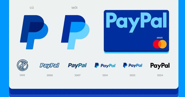
PayPal officially announced its new brand identity, marking a new phase for the world’s leading company in the field of e-commerce, payment services and electronic transfers.
Founded in 1998, with a 25-year history, PayPal has increasingly proven its position with “more than 148 million active accounts in 26 currencies and across 193 markets, processing more than 9 million payments daily.” Recently, PayPal announced a global campaign executed by Havas Worldwide and launched a completely new identity.
The Brand has undergone a major change in its branding and logo, ditching the blue that has been associated with PayPal for over 20 years in favor of a mysterious black. This is a strategic move as PayPal chose to differentiate itself from the blue that has become an iconic color in the fintech industry. This choice helps users easily distinguish PayPal from traditional banks like Citi and Chase, or from fintech companies like Webull, Revolut and Wise.
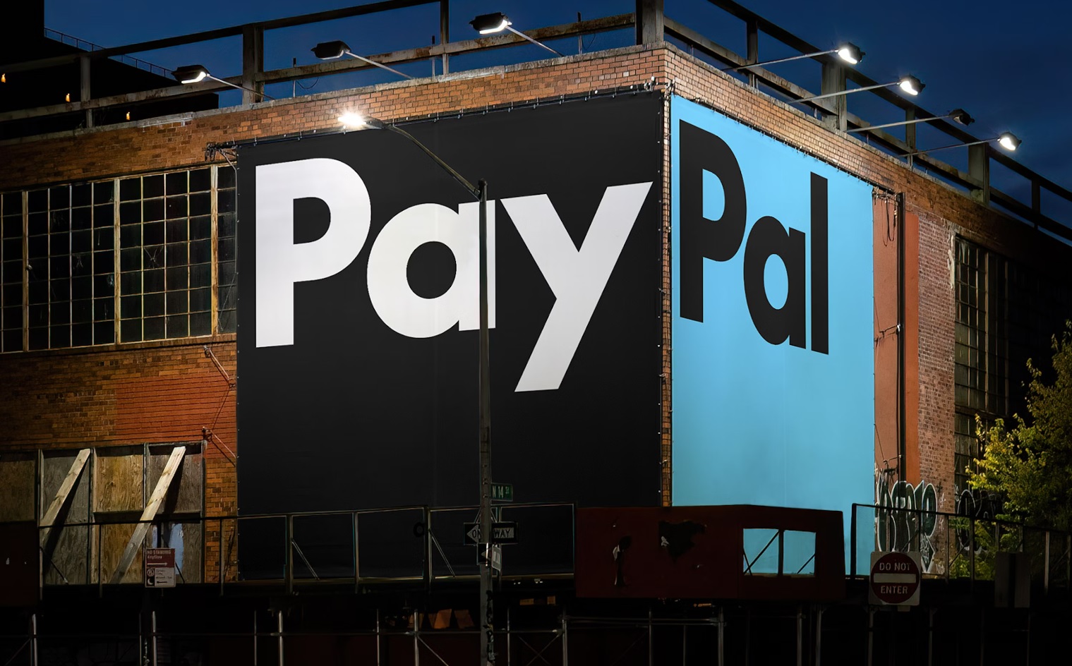
Key changes in PayPal’s Brand Identity
PayPal Logo Updated
Conceived with legendary design firm Pentagram, the new PayPal look is simple, modern, and upbeat. Andrea Trabucco-Campos and the Pentagram team separated the P in Paypal from the brand name, so that each letter could be used on its own. The stacked Ps have been given geometric edges, removing the rounded edges to create a stronger, sharper look. The color scheme has also been updated so that the signature color of Venmo, one of PayPal’s sub-brands, appears in the center, like an overlapping Venn diagram of the monogram.
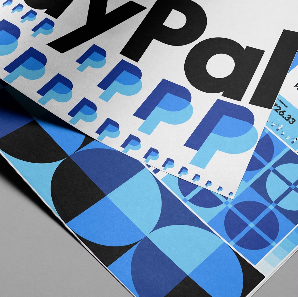
Simple Color Palette
The logo’s colors have also been refreshed, with the dominant blue being toned down to a brighter tone while the dark blue remains as a signature element that makes up the familiar PayPal image. On a simple white background, the lettering details stand out and are more distinct. The expanded color palette has also been significantly changed, with the previously bright yellow being removed and replaced with a subtle black and white palette.
Blue accents are still present, especially on digital apps, to maintain cohesion with other products like Venmo. The color palette has been streamlined to five core tones that work together: white, black, light blue, dark blue, and medium blue. On the PayPal user interface, the old yellow payment buttons have been replaced with sleek black buttons, giving the platform a new, more modern, streamlined look.
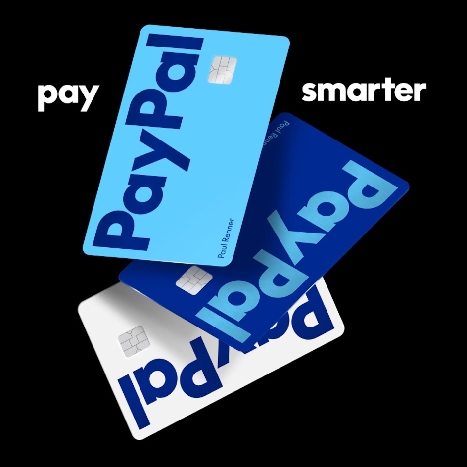
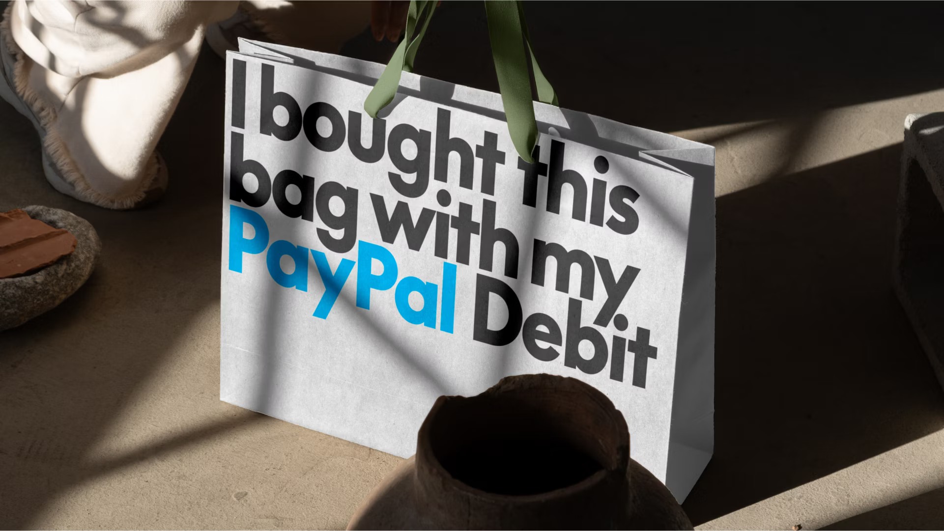
PayPal logo used in debit card design (Image for illustration purposes only)
New PayPal Pro Font
The custom font for the Paypal logo is derived from an existing typeface developed by Lineto Type Foundry, called LL Supreme. (LL Supreme itself is based on the popular sans serif typeface Futura, designed by Paul Renner in 1927. It is currently one of the most popular fonts in the design world.).
Meanwhile, the logo’s typography has been straightened instead of the old slanted style, creating a sharper and more youthful feel. Notably, Pentagram has also developed a complete identity system including a unique typeface called PayPal Pro. This new font is a modern take on the classic Futura, intended to be bold and clear. Additionally, a companion typeface called PayPal Pro Text is being optimized for smaller screens.
Movement and Interaction
The new PayPal brand identity also focuses on motion and interactivity. Pentagram designed the visual system to reflect common user actions such as tapping, swiping, and dragging. These animations are intended to simulate the process of people interacting with PayPal on Mobile Devices. This focus on motion shows the desire to bring a seamless experience to customers, making the brand more attractive and reflecting the user’s actions more intuitively. Animation can be considered the highlight of this PayPal brand identity refresh. Through this, the brand wants to convey the mission of a friendly, simple, and convenient application for users.
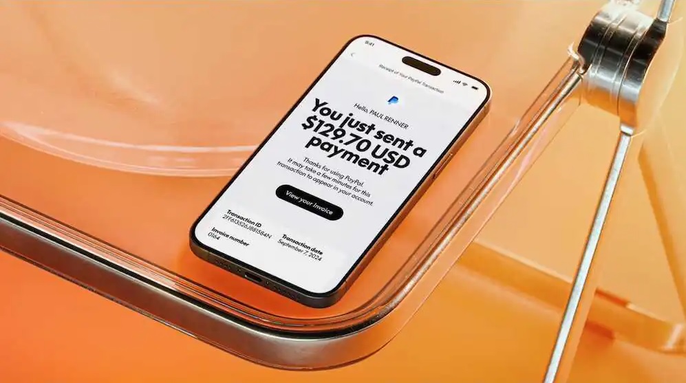
Users are still waiting for the new PayPal UI
After more than 25 years of supporting online transactions, PayPal decided to refresh its interface to match its innovative spirit and commitment to simplicity and user-friendliness. The rebranding campaign by Pentagram helps PayPal connect with a wider audience while staying true to its brand philosophy: everywhere, for everyone.
The Importance of Brand Identity Refresh in a Competitive Landscape
The decision to rebrand PayPal comes at a time when the digital payments industry is more competitive than ever. With competitors like Square, Stripe, and Apple Pay vying for market share, PayPal is being pushed to innovate not just in terms of technology, but also in how it connects and presents itself to consumers.
This rebranding helps PayPal maintain its relevance by updating its interface to a more modern look, ensuring that the design adapts to new technologies and platforms. The new visual identity also aligns with PayPal’s efforts to simplify its services, making them more accessible to users around the world.
PayPal was founded in 1998 as Confinity, which focused on providing software for handheld devices. In 2000, Confinity merged with X.com, a financial services company founded by Elon Musk. X.com soon changed its name to PayPal, and in 2002, eBay acquired the company for $1.5 billion. For many years, PayPal served as PayPal’s primary payment system.
In 2015, PayPal split from eBay and became an independent public company on the NASDAQ stock exchange. Since then, PayPal has continued to grow, expanding its services to include Venmo, and financial products aimed at making online payments more accessible and secure.
Source: Synthesis
Comment Policy: We truly value your comments and appreciate the time you take to share your thoughts and feedback with us.

Note: Comments that are identified as spam or purely promotional will be removed.

To enhance your commenting experience, consider creating a Gravatar account. By adding an avatar and using the same e-mail here, your comments will feature a unique and recognizable avatar, making it easier for other members to identify you.

Please use a valid e-mail address so you can receive notifications when your comments receive replies.
