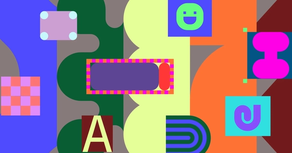
After 5 years of sticking with the old brand identity, Figma has recently officially transformed with a new identity. Along with the visual change, Figma also offers new directions on the upcoming development journey, aiming to position itself as a design tool for everyone from professional designers to amateurs.
4 new pillars of Figma
In this refresh campaign, Figma has highlighted 4 new pillars of this design platform in the future including:
- Multi-use Shapes: Represent the different individuals involved in the co-creation process.
- Dynamic Layouts: Reflect different ways of creating and constructing designs.
- Extensive Color Palette: Easily adaptable in many contexts.
- Integrated Movement: Simulating actions and processes in the Creative process.
According to Figma, these 4 elements will help the platform create a more intuitive design language for users, thereby contributing to the goal of becoming a design platform for everyone. Helping every user, whoever they are, can turn their ideas into reality when using Figma.
To develop these 4 elements, Figma’s Brand Studio Team researched and found that Figma’s Canvas is a space where everyone can freely create and interact together. And having all users gather together on Figma to create together is like gathering in a playground.
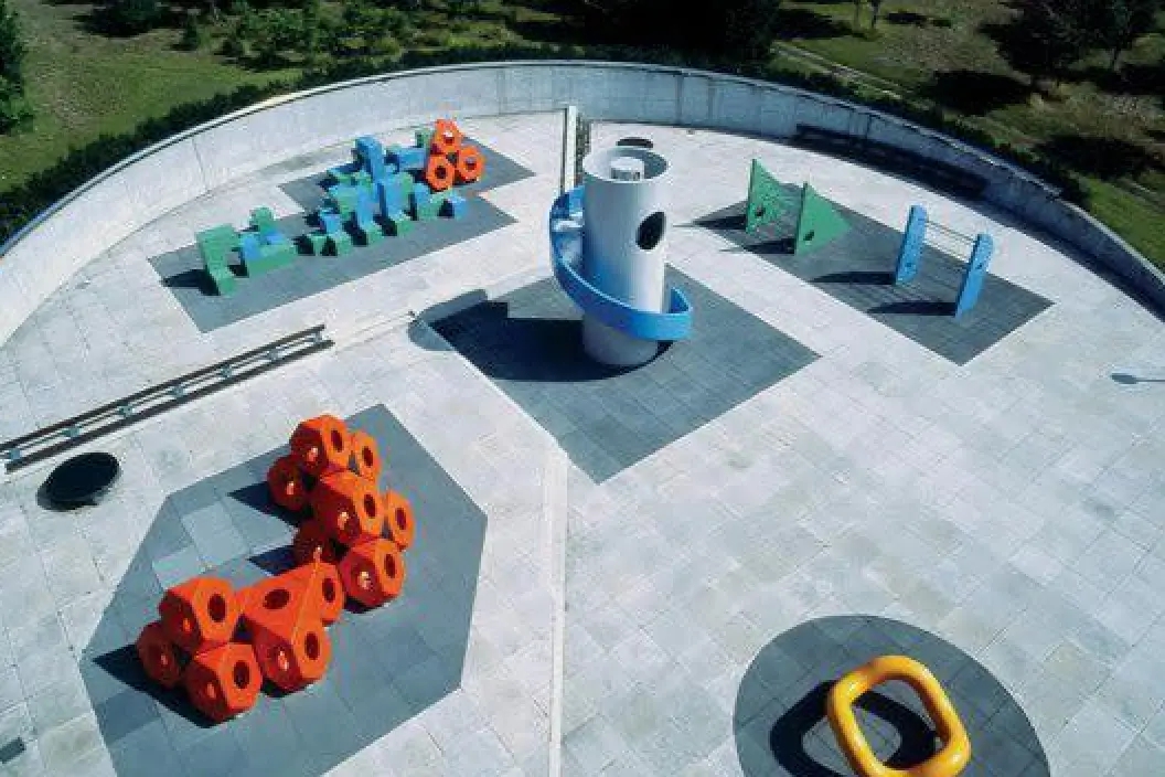
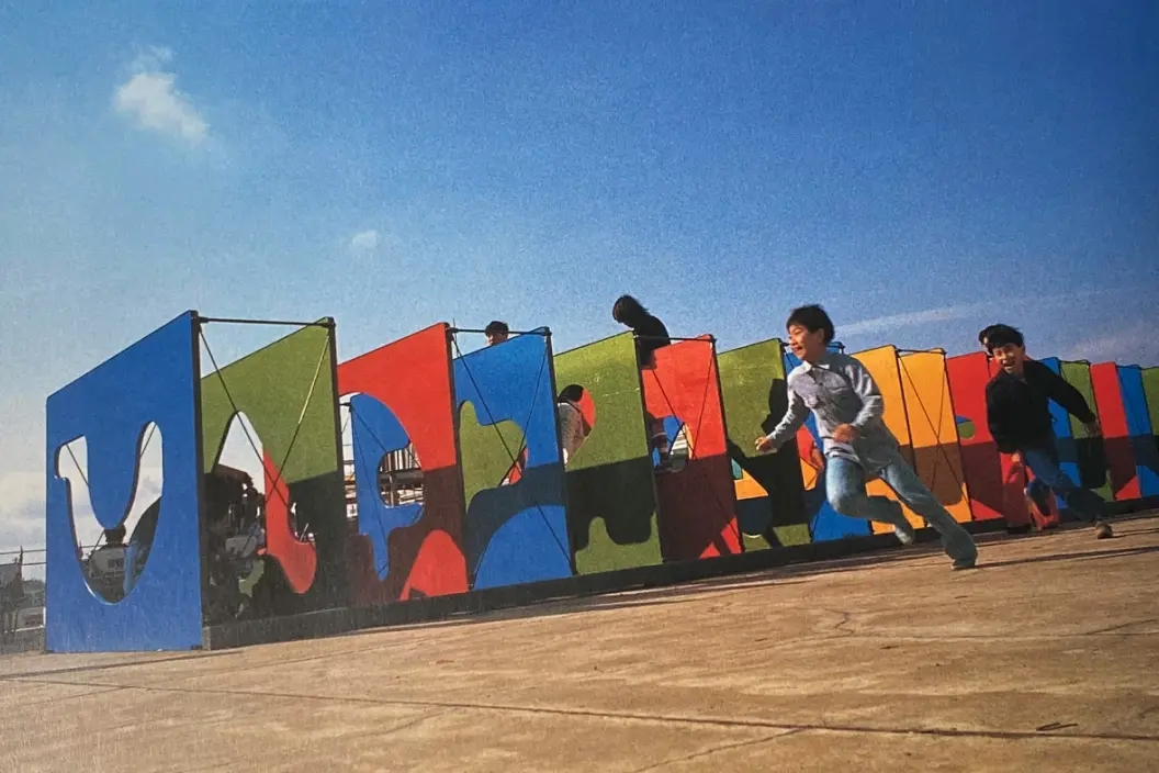
Therefore, Brand Designer Jefferson Cheng shared that Figma’s team was inspired by the art playgrounds designed by two famous artists Isamu Noguchi and Mitsuru Senda. “The playground is a metaphor for Canvas Figma—a place where people gather to create and experiment” – He shared about Figma’s new transformation.
 |
 |
 |
The playground is a metaphor for the Figma Canvas—a place where people come together to create and experiment
Reshape Icons and Illustrations
Figma’s previous illustration system relied heavily on geometric shapes, interacting shapes that represented the main characters. For the refresh, Figma’s team sought to create a more flexible visual language. Brand Studio Director Damien emphasizes that foundational images should be seen as a language: “Strong visual identities should be seen as languages, not systems. The system suggests rigid rules and prediction.”
#1. Versatile Shapes
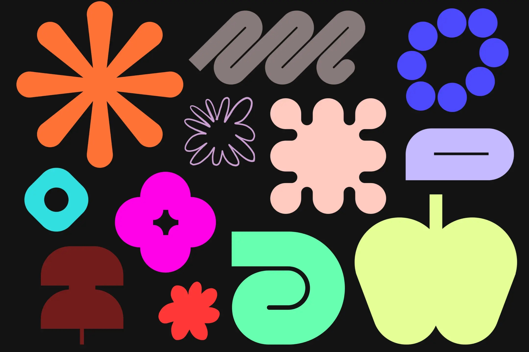
To achieve this goal, Figma’s Brand Studio has developed a collection of basic shapes. These shapes range from blobs to iconic shapes, representing a variety of approaches to design. form and function.
“We intentionally gave the basic shapes a natural, varied look, as if real hands were used to create them,” explains brand designer Leandro Castelao. These somewhat heterogeneous and open-ended designs help the brand show users that “new elements can always be added to the collection”.
While each basic shape is different, they still have one common feature: clear graphics and a “giant” size compared to previous versions. Inside those large designs are meticulously cared for and highly precise details.
#2. Dynamic Layout
In Figma, objects can interact with each other on canvases, creating unlimited layouts and different creative layouts. To standardize these layouts, Figma’s team reviewed the list of user methods and actions, from initial ideation, through design, coding, testing,. ..
Summarized, it can be seen that these actions include four main movements:
- Overlap: The shapes overlap each other.
- Reveal: A selected shape can “inspect” or reveal the underlying structure of another element.
- Clustering: Shapes and patterns group together into free-form compositions.
- Multi-move: Different layouts combined together.
#3. Expanded Color Palette
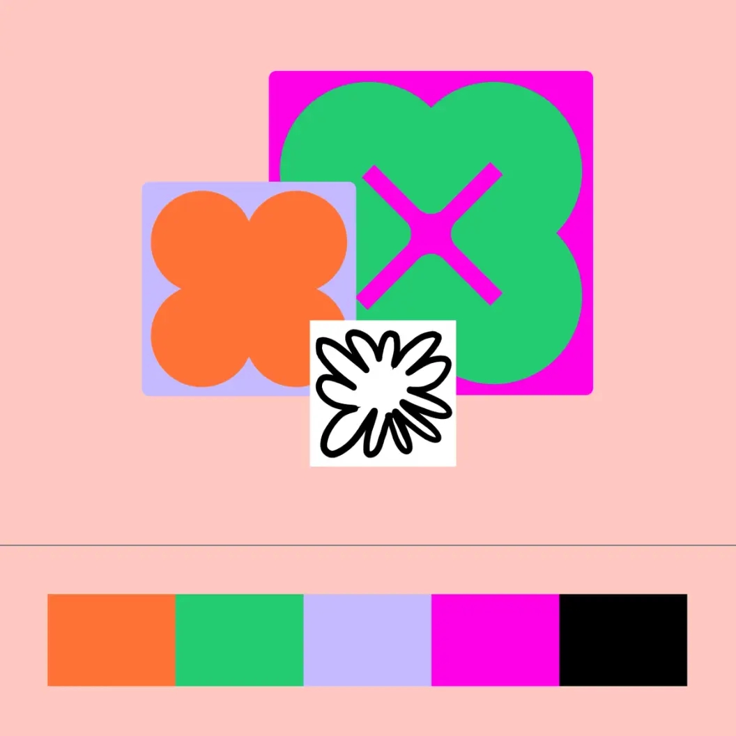
Besides the shapes and composition, the expanded color palette also plays an important role in highlighting Figma’s new message. The brand has kept its signature purple, but has introduced a richer range of colors, including bold primary tones, bright neons and pale earth tones. Figma shares, this new color palette reflects the diversity of the brand’s community and the rich creative possibilities that users can make using the platform.
The team built three color palettes, each consisting of a pair of vibrant primary colors and four secondary colors. The palettes have light and dark modes, swapping the secondary colors depending on the context. With no black borders between the color frames, the colors are designed to overlap, creating sharp contrast and a sense of movement, “like the energy and flow of teamwork,” Figma shares.
 |
 |
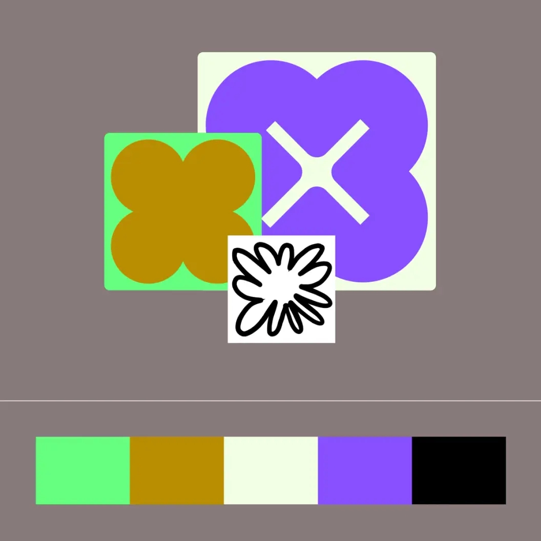 |
The expanded color palette also plays an important role in highlighting Figma’s new message
“Brands with signature colors like Coca-Cola or John Deere have spent a lot of time building that value and, in fact, they were early to market with that color, ” Damien shares. “With Figma, we have a great internal team and they pushed for a more refined palette, we needed a spectrum of colors with disciplined use rather than a limited use of color.”
The two color principles pointed out by Figma include:
- Tonal Vibrancy: Colors create surprising and interesting combinations while balancing the contrast and differences of each color.
- Flexibility, Adaptability: The color palette offers flexible use, allowing changes from dark to light, from simple to complex, to suit different needs.
#4. Integrated Movement
Movement is an integral part of Figma’s design principles. Movement has been integrated into every detail of the new identity. These movements represent 3 elements:
- Freestyle : Introduce camera movements and parallax effects to create a sense of limitlessness and reference to seemingly endless canvases.
- Interactive : Elements react, adapt, and transform based on the interactions and inputs they receive, demonstrating the brand’s adaptability and flexibility.
- Craft : Agile, flexible movements that simulate the many decisions made during the design process, never completely perfect, but always evolving and changing.
Source: Figma
Comment Policy: We truly value your comments and appreciate the time you take to share your thoughts and feedback with us.

Note: Comments that are identified as spam or purely promotional will be removed.

To enhance your commenting experience, consider creating a Gravatar account. By adding an avatar and using the same e-mail here, your comments will feature a unique and recognizable avatar, making it easier for other members to identify you.

Please use a valid e-mail address so you can receive notifications when your comments receive replies.
