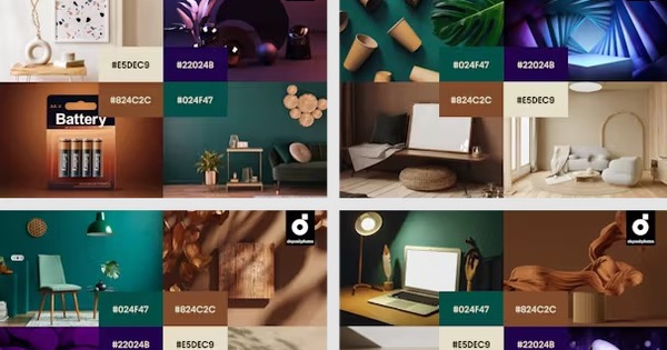
From soft Sandstone to dramatic Midnight – Discover this fall/winter color trends that can help your campaign stand out and attract attention!
Fall is one of the busiest marketing seasons of the year as brands gear up for big events like Halloween, Christmas Day, Black Friday, and Chinese New Year. Depositphotos has researched visual, design, and fashion trends to reveal the color palettes that will be a big hit this fall/winter 2024. With a wide range of applications from website updates to media images or display ads during special occasions, you can choose these colors to impress your customers.
After the vibrant, vibrant colors of summer, autumn and winter bring a series of soft but deep shades, bringing a sense of peace, authenticity and closeness to nature. The most prominent are Sandstone, Saddle Brown, Pine Grove and Midnight.
The warm and earthy palette above captures the spirit and feeling of the season – bringing more mood, coziness, softness and calmness. All four shades are timeless classics, suitable for everything from minimalist graphics to high-end designs. You can combine the colors to create visual impact or standout designs with the ideas below.
4 Fall Winter Colors for Communication Campaigns in 2024
Sandstone (#E5DEC9)
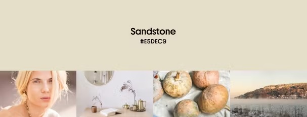
Sandstone Color
Where to use: Background colors for websites and advertisements, images for communication campaigns or product packaging design
Best suited for: Brown, blue, purple, red and green
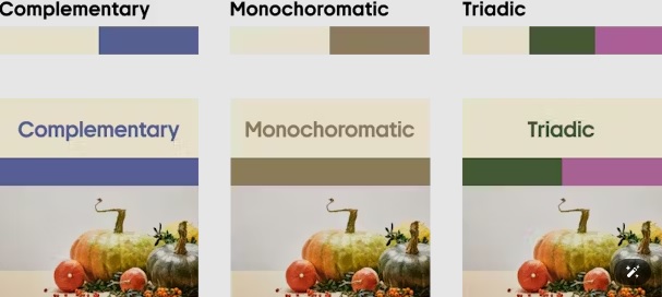
Color combinations with Sandstone
Sandstone is the latest update to light gray, combining the balance of gray with the warmth of beige. You can see it in dried flowers, wood, clay, cozy sweaters and bedding. The subtle shade of Sandstone is soft and casual, yet calm and stable, making it perfect for fall.
If you are looking for a basic color that looks neutral but not too dull, Sandstone is the perfect choice. This color is suitable for simple, rustic designs, evoking harmony and comfort. At the same time, it looks luxurious and modern. If you need a design inspired by nature, you can combine Sandstone with green. When Sandstone is combined with blue, orange or red, it creates an attractive contrast.
Saddle Brown (#824C2C)
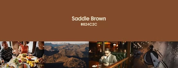
Saddle Brown Color
Where to use: Branding, Advertising, Website Design and product packaging design
Best suited for: Beige, blue, green and purple
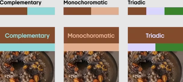
Saddle Brown Color Scheme
By adding a touch of orange to brown, Saddle Brown brings warmth to the fall/winter 2024 color palette. This color is reminiscent of withered leaves, bark, and earth, creating a strong connection to nature. This shade is perfect for leather goods and is one of the top design color trends this year, inspired by celebrities like Beyonce and Pharell Williams. If a Brand wants to highlight their stability and professionalism, this color brings a sense of tradition and trust. With a classic and sophisticated feel, Saddle Brown can be combined with bright colors like blue or orange to make it more attractive.
Pine Grove (#024F47)
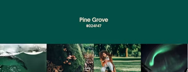
Pine Grove Color
Where to use: Eco design, interior design, website design, branding
Best suited for: Dark red, brown, yellow, gray and green
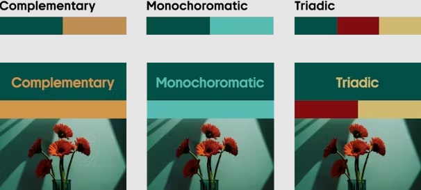
Pine Grove Color Scheme
Pine Grove has a fresh and elegant feel, representing elements of nature and sustainability. This color suits many aesthetic styles, is the choice in advertising images of many luxury brands, high-end products. It creates a stunning effect when used as a main color in interior design, print or digital.
Midnight (#22024B)
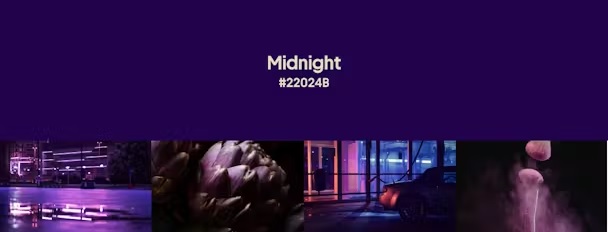
Midnight Color
Where to use: UI design, branding, marketing materials
Best suited for: Lime, pink, green and purple
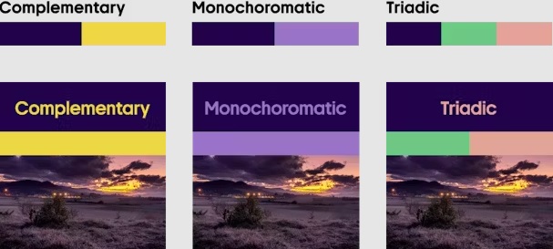
Color scheme with Midnight color
True to its name, Midnight is a dark, mysterious, and irresistible color. It is a blend of a powerful dark blue with a hint of purple (similar to the color of eggplant and blueberries). Midnight conveys a sense of stability and professionalism, making it a popular choice for branding and color positioning.
This color has strong associations with luxury and exclusivity, making it a great fit for branding premium experience products. Midnight is great for fonts, ensuring readability on light backgrounds is more distinctive than when using standard black. If you choose Midnight in your designs, use it in combination with lighter shades, avoiding dark blues which can create a gloomy and sad effect.
Summarize
Each brand has its own brand guidelines that are suitable for its positioning. Color trends are a useful tool to diversify and refine advertising design publications according to user tastes. Hopefully, the above 4 color trends will help marketers save time finding inspiration and content in the upcoming fall-winter 2024 season.
Source: The Drum
Comment Policy: We truly value your comments and appreciate the time you take to share your thoughts and feedback with us.

Note: Comments that are identified as spam or purely promotional will be removed.

To enhance your commenting experience, consider creating a Gravatar account. By adding an avatar and using the same e-mail here, your comments will feature a unique and recognizable avatar, making it easier for other members to identify you.

Please use a valid e-mail address so you can receive notifications when your comments receive replies.
